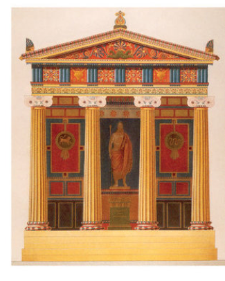
Chromatic Reconstruction of Greek Temples
Source: researchgate.net
Color Trends in Architecture
How it has been in the past and what will it be like in the near future!
Author : Ashmita Gupta (Architectural Intern)
Co-Author : Sakshi Jain (Co-Founder)
A Look into the History
Color in Architecture has an integral role since a large percentage of human-environment-reaction is based on the sensory perception of colors and its psychologies. The concept of using color to enhance Architecture has been referenced since the times of Roman when Vitruvius explains the pigments and colorants and its effects on human nature in his treatise but it was only until much later that the color theory was discovered and yet the subtlety of colors in Architecture can be found since the Greek Architecture, which was not white but was believed to be polychromatic because of the ruins and was later found that the Greek used to paint their temples and family dwellings with vivid colors to hold the sense of harmony. Color was used lavishly to glorify gods, or kings or to celebrate the marvel of the building itself.
Color and Architecture
Although the subtle use of colors without knowing its impact has been used since forever, it was only until the 20th century that Architects started to realize the weight of its impact on the human brain. The psychology of every color stimulating certain emotions came to known and the trend to add emotions to the buildings through color became a much-needed trend.

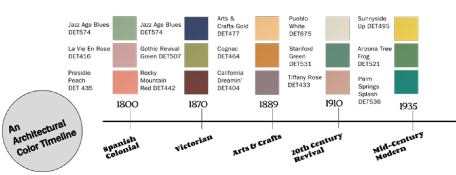
Source: Dunnedwards.com
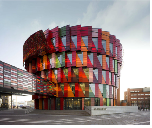
The conscious use of color palette became almost a necessity. With the use of materials to bring out their natural color to add colorant to bring out human emotions in the user’s conscious, the palette was chosen delicately. With early Industrialization, it was more natural to bring out greys of concrete and steel and to create a formal touch to the buildings. Later with the use of glass, the silver-blue tones started to bring a more transparent feel to it. The early modern Architecture, which followed the path of minimalism with the hint of classicism, often used rustic tones of brown and green with white to emphasize the darker, more private comfort in the dwellings. Amidst all trends, many started to experiment with their concepts of color, mixing palettes to un-orthodox their buildings and to create something unique. This gave a distinct style to Contemporary Architecture all around and such buildings emerged that pleases the eyes with their perky spirit.

Kuggen Building - Gothemburg, Sweden
A Renaissance-inspired Building
Source: arch2o.com

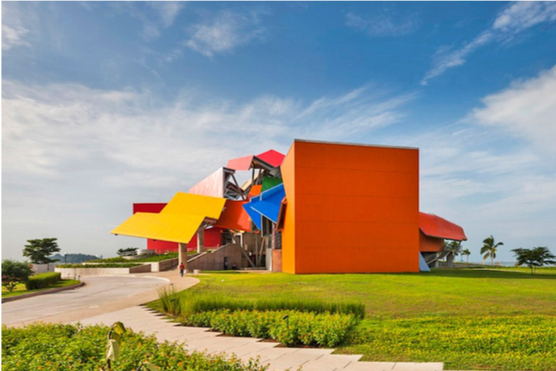
BioMuseo by Frank O Gehry, represents Panama’s tropical palette and is an ode to its biodiversity
Source: architecturaldigest.com
Now Trending
Currently, the color trend has taken a natural and more neutral approach where different materials are being used to add colors instead of colorants, the greys of the concrete mixed with the brown of the wood to the blue of the glass and the green of the plantation. It is no doubt that now sustainability is mandatory hence using plantations in various elevations and anywhere that can be healthy is in trend and thus keeping only the natural tones in trends. Other than that Pantone 2020 color of the year is Classic Blue while in 2019 it was Coral Pink which was more on the pastel side. It is no surprise to say we have come a full circle and now we seek eco-friendly practices and thus we see natural, stable, and balanced yet vibrant and alive colors around us.

Source: architecturalwest.com
The coming age of Gen Z the upcoming decade can be incorporated with much more vibrant and bold colours from the rainbow. The likely use of orange and purple seems fair in the future. Lately, with recent researches on the topic of inclusivity, colors have come to own a lot more credit in Architecture with its visual senses. Many have explored the concept of colors to create spaces for special abilities, like autism and with equality of people’s rights and choices to build a healthier and equal space to live in which can easily explain the impact of colors as something much more than just aesthetic. The future of Architecture should be inclusive, comforting, and sustainable and to create such future, one must know the impact every element in which colors hold their importance.